
FROM GEORGE PRATT
A few simple tips. Choosing a proper base for your sculpture is a bit like choosing accents for the furniture in a room. Few people have a problem with that, and they should approach choosing a sculpture base with the same judgment.
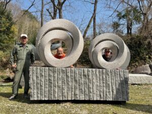
If the sculpture is sharp and angular, make the base soft and round; if it is round or lumpy and organic, make the base square.
If the sculpture is light-colored, make the base dark-colored and vice versa. It is best to have a complementary contrast between the sculpture and base. (e.g. a green Serpentine sculpture looks good on a red or black granite base) Keep it simple.

Size is tricky because with stone, we are dealing with mass rather than the area or simple length. Optimally, however, one can be guided by the unfailing “golden rule” (look it up on the internet!)
It is the rule where you make a series of numbers, each one is the sum of the previous two: 1,2,3,5,8,13, etc. If you cut a piece of paper and you want it to look ‘right’ make it any two adjacent numbers. Many common things look ‘right’ because they follow this rule, i.e., a playing card, a 5″x 8″ photo. Try to apply the golden proportion to the mass of your sculpture, pick any two numbers from the series mentioned above, make the base the smaller of the two, e.g. if the sculpture represents a mass of 8, make the base a mass of 5 and so on. Sculptors will want to stretch the ratio of course. Often it can be done to a good effect; when you think of the Marble version of the famous Brancusi ‘BIRD IN SPACE’ sculpture, it looks wonderful with a base that Seems to be all wrong proportionally, i.e.; it is a tall, thin sculpture, the base of which it is mounted in the Metropolitan Museum of Art is so short as to be a flagrant stretch of the golden proportion.
Yet it looks ‘right’, which illustrates that the rules are there to be broken. Whatever proportion one chooses, the overarching rule should be that it must perform the function, i.e., have a wide enough footprint that the sculpture can’t be pushed over easily. In this ‘BIRD IN SPACE’ breaks all the rules again.
NOW GET BUSY AND TRY THE ‘GOLDEN PROPORTION’
FROM JOANNE DUBY & DON DOUGAN
The base for a sculptural work is often a functional necessity to present the form in space in a way to convey the expression desired. The relationship of the base to a sculpture is often overlooked in sculpture classes. The base for a sculpture is in many ways like the frame around a picture. It locates the work, defines the space around the form, and serves the basic function of fastening the work to a specific place for ideal viewing.
It must first fulfill a function to stabilize and support the form. It should not compete for the viewer’s attention. This is accomplished using very plain, simple geometric forms which harmonize with the sculpture but do not detract from it.
The base is used to flesh out or complete the sculptural ‘character’. This might be done by using contrasting material, texture, or form. If the base were to be removed or changed into a simple pedestal, it would diminish the overall expression of the work. A ‘busy’ or heavily veined marble for instance, would not show well on a ‘busy’ base material. Or a textured work would show best on a simple polished black granite base.
The proportions of the base are relative to the size and shape of the sculpture. The width and depth of the base is usually most pleasing if it is either slightly larger or smaller than the width and depth of the work. If the sculptor follows the above ‘rule of thumb’ when mounting work, then the presentation will be acceptable to galleries and clients alike. The base serves to ‘set the stage’ for the sculpture and gives the viewer a context for the story the sculptor wished to express.

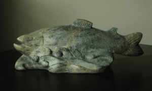
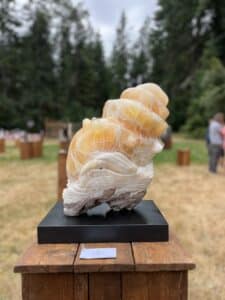
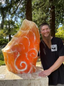

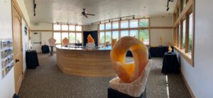

We need some kind of descriptive text here.